B2B marketplace
Brand repositioning, design system, product flows
Starting point
What it was about
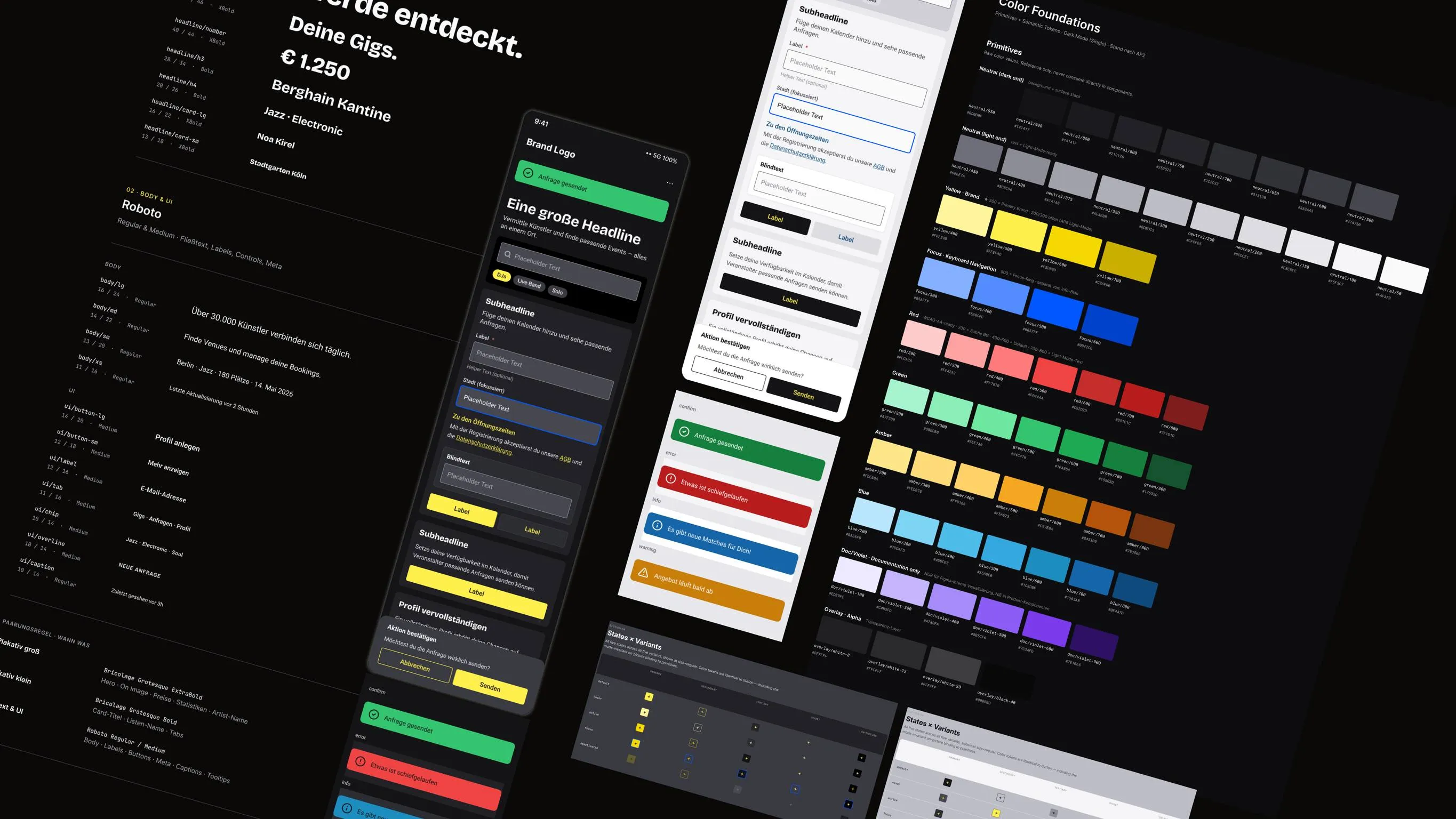
A B2B marketplace for music, grown over years. A new concept for the user experience and product innovation both required a newly designed user interface.
The modernization ran on several levels at once: brand strategy, a modularized UI and a tokenized handover to implementation, including documentation the team can carry on with seamlessly. Reworking and developing something that already exists is harder than drawing a brand from scratch.
The process
Foundations first, then the components
The brand takes a new form without breaking the relationship with existing customers while the product is being changed over.
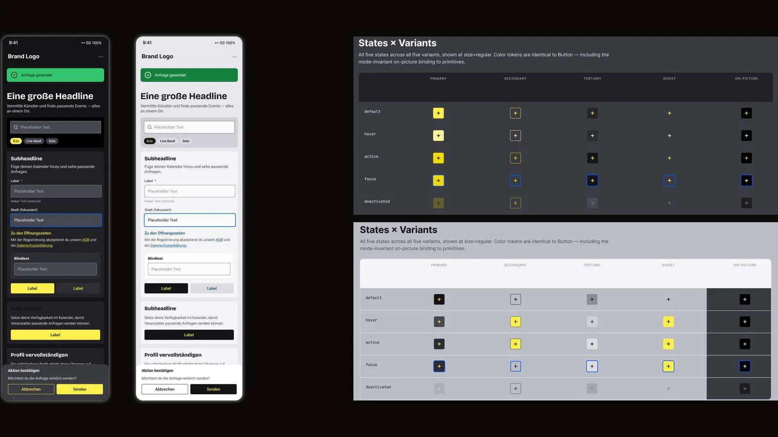
The extensive set of components was derived from what the planned flows needed. But the foundations came first: variable collections for color, typography, spacing, radii and elevation, each for dark mode and light mode. The modes are not mirrored: where a contrast did not hold, the role was given its own value in the other mode.
The values exist as semantic tokens. Components reference roles such as text/primary or surface/component, never fixed color values. A mode switch is therefore a matter of runtime. The design work sits in the tokens and was done once.
On top of that, the components
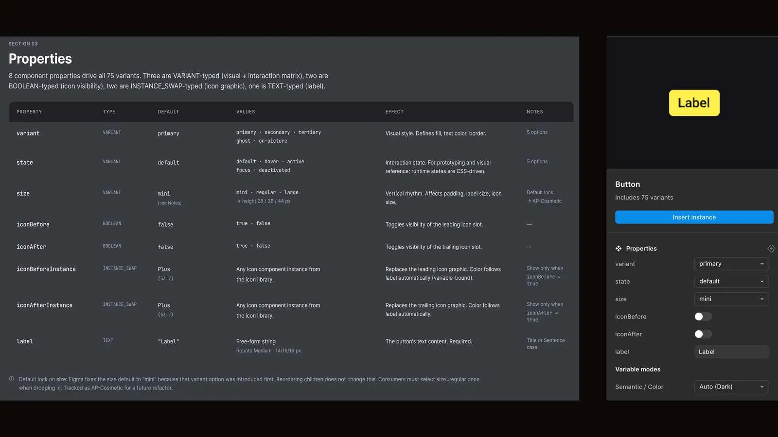
Buttons, icon buttons, inline links, text inputs and composed fields. Each has a small, predictable set of properties. In composed components, the properties of the inner elements appear directly on the outer one, through exposed instances. That saves the usual passing through of properties, and the mistakes that come with it.
UX writing guidelines were developed in parallel and fed straight into the microcopy of the prototype build.
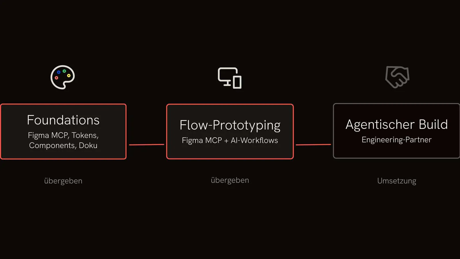
On this basis the first three essential product flows took shape. They were prototyped in Figma with AI support and handed over to the engineering partner, who works agentically.
The documentation does not sit beside the component but with it, in Figma, and was recorded alongside the build: anatomy, properties as a table, a state matrix and notes for migrating older versions. All frames follow the same pattern, so engineering learns the format once.
In addition, a project handover was delivered as an .md file covering the design system, the decisions that were made and the build.
Outcome
What it achieved
The brand is repositioned, the design system delivered, and engineering can carry on with it seamlessly. Dark mode and light mode stood side by side as equals from the start, so there is nothing to retrofit. The component library is smaller because variants were consolidated. That lowers the maintenance effort. The library lives in Storybook, the documentation in Figma and as a Markdown file. The knowledge stays in the company, readable for the team and for its tools.